Using the Dashboard
The Dashboard is your at-a-glance view of how the business is performing. Open it any time you want a single screen showing your most important KPIs, trend charts, and summary tables all driven by the same data that powers the rest of Planir.
Why this matters
Reports tell you what happened in detail. The Dashboard tells you what's worth paying attention to right now. Customizing it once means every time you log in, you land on the numbers that matter most to your role and your business — without having to navigate through individual statements or build a report from scratch.
When to use this
- For a daily or weekly check-in on key business metrics
- Before a leadership, board, or investor meeting to gather headline numbers
- When you want to share a single live view with your team or external stakeholders
- When tracking a specific theme (e.g., profitability, cash position) across multiple entities or periods
Before You Start
Make sure you have:
- A connected data source so your accounts, KPIs, and statements are populated
- Your Chart of Accounts reviewed in Setup → Chart of Accounts
- Your KPIs configured in Setup → Metrics with targets and limits
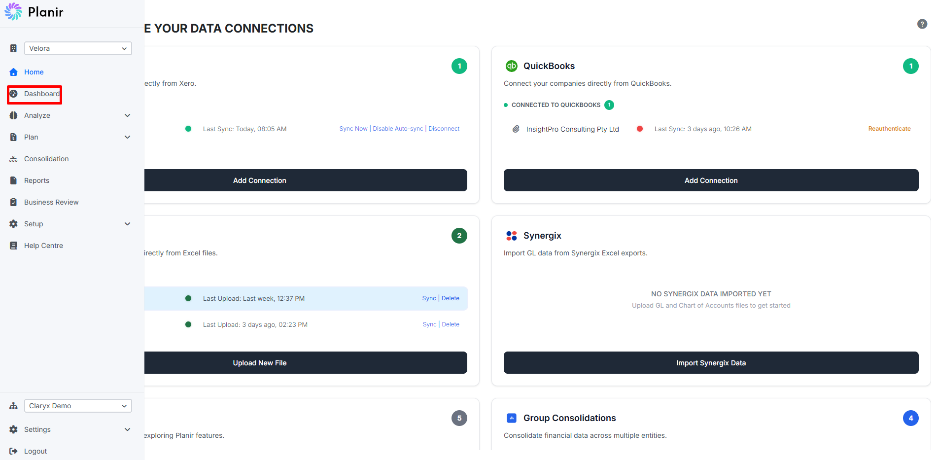
Step 1. Open the Dashboard
From the sidebar, click Dashboard.
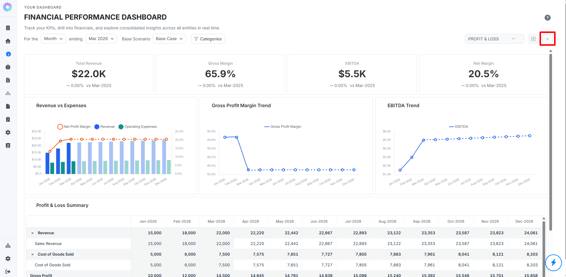
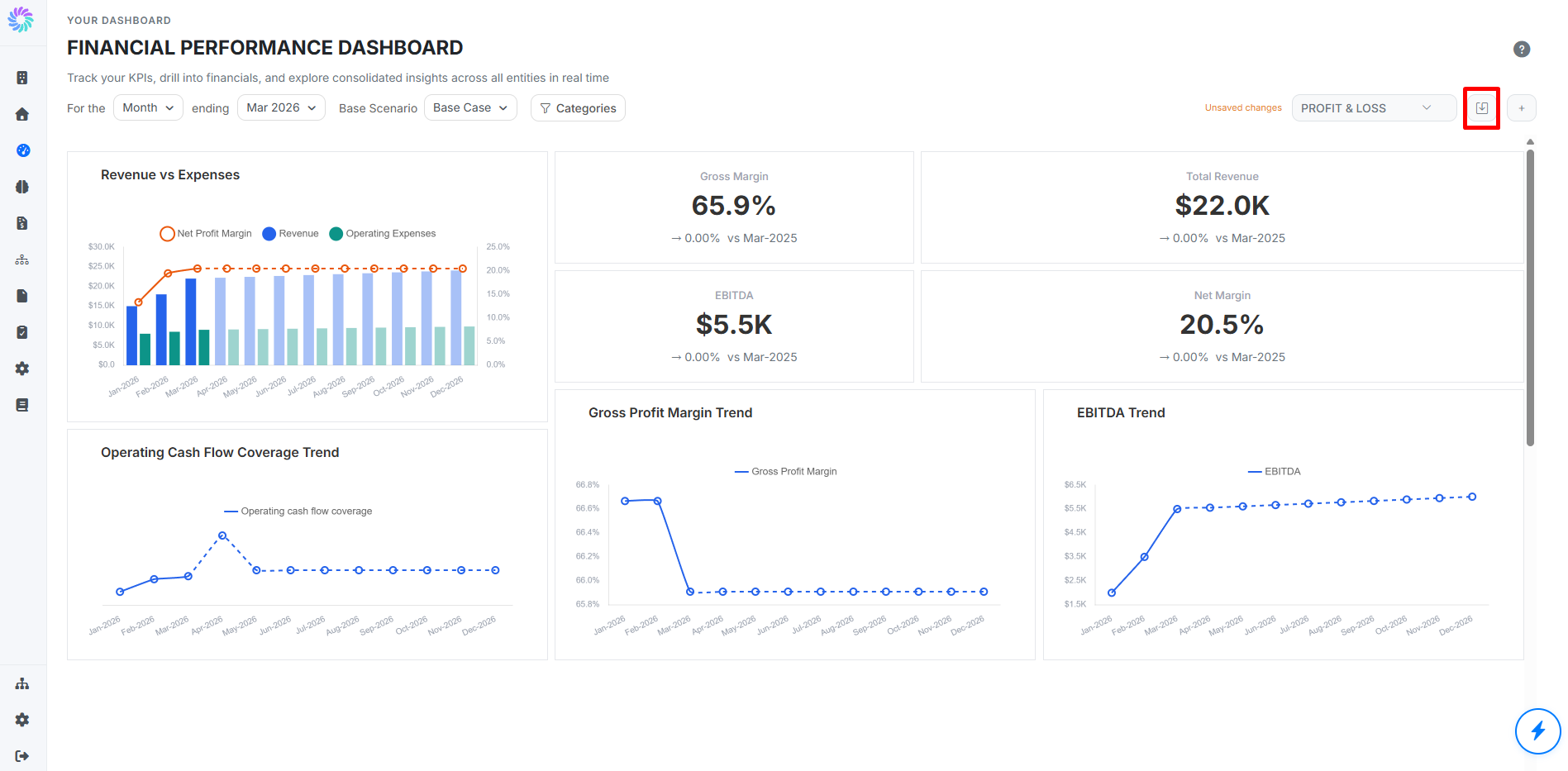
The Dashboard opens with your default view. Typically a Financial Performance Dashboard showing your top KPIs, trend charts, and a Profit & Loss summary table.
Step 2. Understand the Layout
A standard Dashboard view contains three layers of information:
- KPI tiles at the top — one number per tile (e.g., Total Revenue, Gross Margin, EBITDA, Net Margin), each with a comparison badge against the prior period
- Trend charts in the middle — visualizations like Revenue vs. Expenses, Gross Profit Margin Trend, and EBITDA Trend
- Summary tables at the bottom — rolled-up financial statements (e.g., Profit & Loss Summary) shown across periods
Step 3. Adjust the Period and Scenario
Use the controls at the top of the page to change what you're viewing:
- For the [Month] ending [Date] — change the period type (Month, Quarter, Year) and end date
- Base Scenario — choose which scenario the Dashboard reflects (e.g., Base Case, Best Case, Worst Case)
The selected period and scenario apply to every tile on the Dashboard at once.
Step 4. Switch Between Dashboards
Use the dashboard selector in the top right (e.g., PROFIT & LOSS) to switch between any saved dashboards in your workspace. Each dashboard is a separate, fully-customizable layout so you can have one for profitability, another for cash flow, another for board reporting, and so on.
The download icon next to the selector exports the current dashboard view.
Step 5. Add a Tile
Click the + button in the top right of the Dashboard to open the Add New Tile wizard.
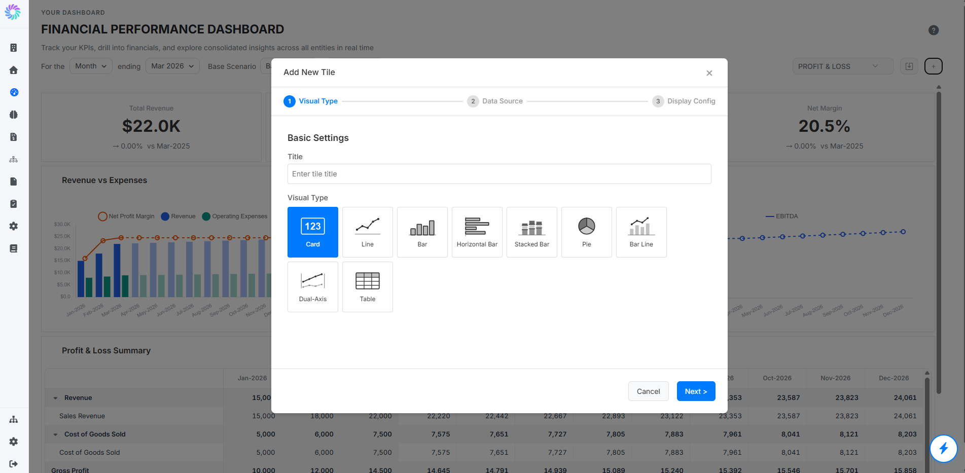
The wizard has three stages: Visual Type, Data Source, and Display Config and supports seven visual types including Card View, Line Chart, Bar Chart, Pie Chart, Bar-Line Combination Chart, Dual-Axis Line Chart, and Financial Table.
For a full walkthrough of each stage, see Tile Configuration.
Step 6. Move and Resize Tiles
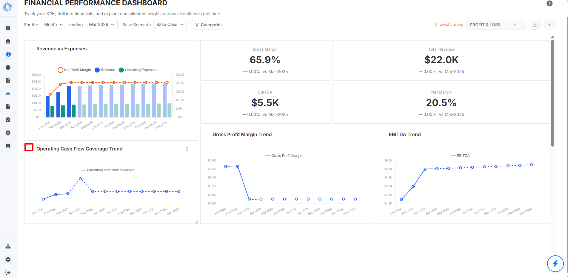
Once a tile is on the Dashboard, you can rearrange and resize it:
- Move a tile — hover over its top-left corner to reveal the drag handle (six dots), then drag the tile to a new position on the grid
- Resize a tile — drag any corner of the tile to make it wider, taller, or both
Step 7. Save Your Dashboard
Whenever you add, move, resize, or remove a tile, an Unsaved changes indicator appears next to the dashboard selector. Save your changes so the layout is preserved the next time you log in.
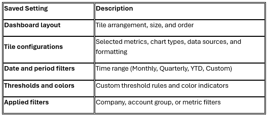
When you save a dashboard, Planir captures all active settings, including:
When to save
- After finishing or customizing a layout you want to reuse regularly
- Before regenerating the dashboard with new data, if you want to preserve the current snapshot
- When creating separate dashboards for specific teams, entities, or reporting periods
- When switching focus areas (e.g., Profitability vs. Cash Flow dashboards)
How to save
- Open the dashboard you want to save (or build a new layout from scratch).
- Click the save icon next to the Unsaved changes indicator at the top right of the page.
- If this is the first save for a brand-new dashboard, enter a name (e.g., "Executive Overview" or "Monthly Performance"). If it's an existing dashboard, the same name will be updated with your latest configuration.
Step 8. Save as a New Dashboard
To keep your current dashboard intact and create a variant from it:
- Click the three-dot menu beside the dashboard title.
- Select Save As New Dashboard.
- Give it a distinct name (e.g., "Q1 Board View" or "Cash Flow Focus").
- Click Save.
Your previous layout will remain unchanged, and a new dashboard will be created with your current selections.