Tile Configuration
Tiles are the building blocks of every Planir dashboard. Use the Add New Tile wizard to choose how a tile looks, what data it pulls from, and how it displays so each tile communicates exactly what you need it to.
Why this matters
Different datasets need different visualizations. A trend over time reads best as a line chart, a single performance number reads best as a card, and a breakdown by category reads best as a bar or pie chart. Knowing how to use chart types, data sources, axes, legends, labels, and comparison settings helps you design tiles that are accurate, intuitive, and easy to interpret without manual formatting or external tools.
When to use this
- When adding a new tile to an existing dashboard
- When choosing the best chart type for a metric or KPI
- When adjusting axes, labels, or visual formatting on an existing tile
- When comparing performance year-on-year or across scenarios
- When refining dashboards for reporting or stakeholder review
Before You Start
Make sure you have:
- A connected data source so accounts, KPIs, and statements are populated
- A clear view of what the tile is meant to show (the metric, the time period, and the audience)
- A dashboard open in Dashboard where the tile will live
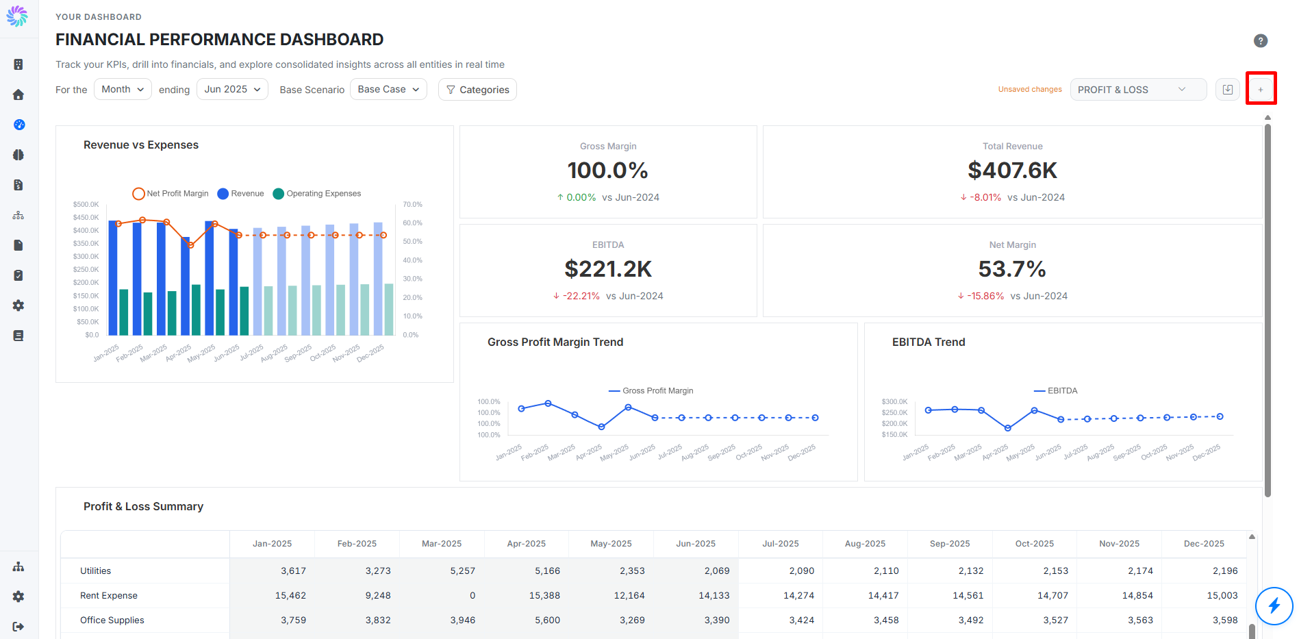
Step 1. Open the Add New Tile Wizard
From an open dashboard, click the + button in the top right corner of the page. The Add New Tile wizard opens. The wizard has three stages: Visual Type, Data Source, and Display Config.
You can move forward and back between stages with the Next and Back buttons. Click Cancel at any time to discard the tile in progress.
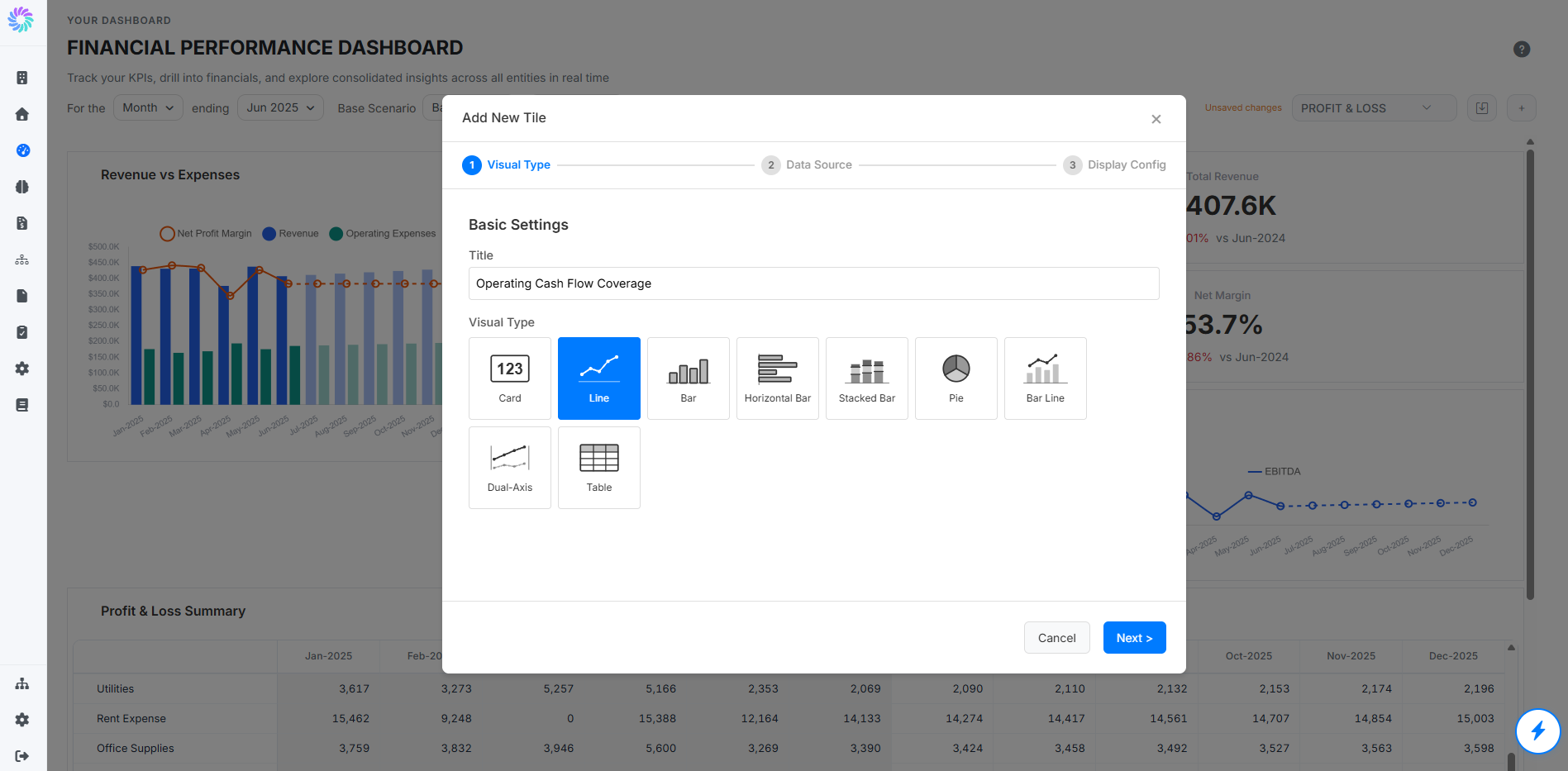
Step 2. Choose a Visual Type
In the first stage, give the tile a Title and choose how it should be displayed. Planir supports seven visual types:
- Card View for a single headline number with a comparison badge (e.g., Total Revenue, Free Cash Flow)
- Line Chart for a trend over time, like Revenue or EBITDA across months
- Bar Chart for comparison across categories or periods, like revenue by channel
- Pie Chart for composition or share, like revenue mix by product line
- Bar-Line Combination Chart for showing two related metrics together, like revenue (bar) with margin (line)
- Dual-Axis Line Chart for two trends on different scales, like growth rate (%) alongside absolute revenue ($)
- Financial Table for a rolled-up financial statement, like a Profit & Loss summary by month
Click Next to continue.
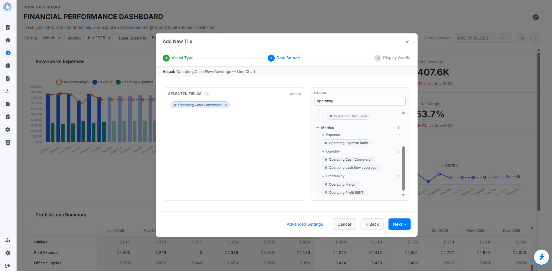
Step 3. Choose a Data Source and Fields
In the second stage, choose where the tile pulls its data from. Available source tabs may include:
• Profit & Loss for revenue, cost, and operating expense accounts
• Balance Sheet for asset, liability, and equity accounts
• Cash Flow for operating, investing, and financing cash movements
• Metrics for KPIs configured under Setup > Metrics
• Model KPIs for KPIs created with Model Builder
Use the search box or expand the account tree to find the accounts, metrics, or KPIs you want to include. Click or drag each item into the selected fields area to add it to the tile. The selected count appears at the top of the panel.
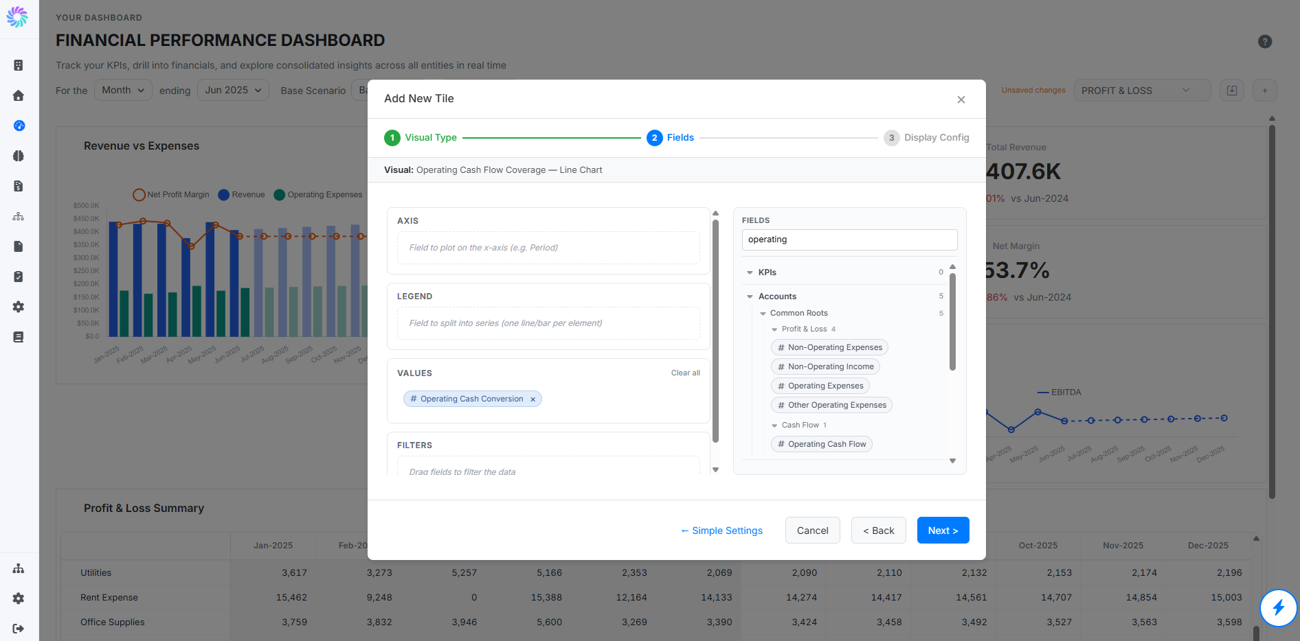
By default, Planir shows a simple field selection view. For more control, click Advanced Settings.
In Advanced Settings, you can assign fields to specific parts of the chart:
• Axis — choose the field plotted on the x-axis, such as period, month, entity, department, or category
• Legend — split the chart into separate series, such as revenue by entity or expense by department
• Values — choose the numbers to display in the chart, such as revenue, operating expenses, operating cash flow, or KPI values
• Filters — limit the tile to specific entities, accounts, departments, scenarios, or other dimensions
Use Simple Settings to return to the standard selected-fields view at any time.
Click Next to continue.
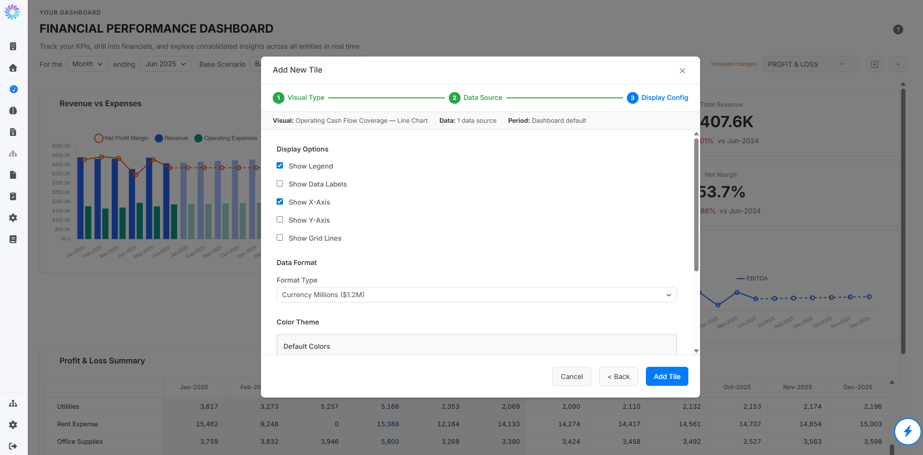
Step 4. Configure Display Options
The third stage controls how the tile renders on the dashboard. The available options vary slightly by visual type, but typically include:
- Show Legend: toggle the legend that names each series
- Show Data Labels: print the value next to each data point
- Show X-Axis: toggle the horizontal axis (typically the time axis)
- Show Y-Axis: toggle the vertical axis (typically the value axis)
- Show Grid Lines: toggle background grid lines for easier reading
- Compare to Prior Year: overlay the same metric from the prior year for visual comparison
- Comparison Scenario: pick a scenario (such as Best Case or Worst Case) to compare against the current values
- Data Format: control how numbers are displayed (decimals, currency symbol, percentages)
A summary at the top of the stage confirms the visual, the data source count, and the period and scenario context the tile will use.
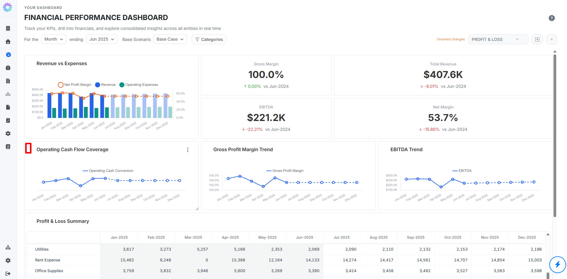
Click Add Tile to finalize. The new tile appears on the dashboard, where you can move and resize it as needed.
Step 5. Edit an Existing Tile
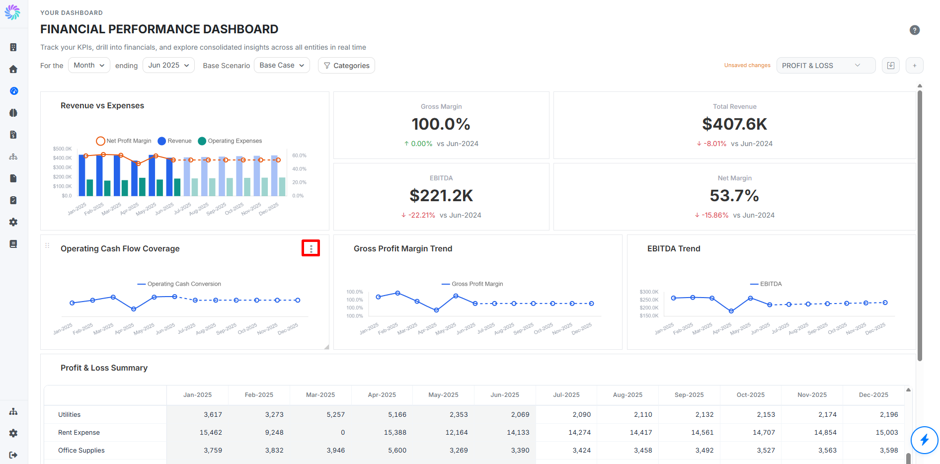
To change a tile already on a dashboard, hover the tile and click the three-dot menu in its top right corner. Choose Edit to reopen the Add New Tile wizard, pre-filled with the tile's current settings.
Step through the same three stages (Visual Type, Data Source, Display Config) to update anything you need, then click Add Tile to save your changes back to the dashboard.
The same three-dot menu also lets you delete the tile from the dashboard.