Setting up KPIs
Track your company's most important numbers in one place. Planir automatically calculates a starter set of KPIs from your connected data, lets you compare them across periods or against a forecast, and gives you a Custom Metric Builder when you need to define your own.
Why this matters
Your KPIs are the fastest way to take the temperature of your business. Because Planir builds them directly off your General Ledger and refreshes them whenever your data refreshes, you always see live numbers and the ability to compare against last period, last year, or your Base Case scenario means you can spot drift the moment it shows up.
When to use this
- When setting up Planir for the first time and reviewing your starter KPIs
- When you want to compare the current period against last month, last year, or a forecast
- When a number looks off and you want to filter or drill into a specific metric
- When you need to track a custom KPI that isn't included out of the box
Before You Start
Make sure you have:
- A connected data source so your accounts are loaded into Planir
- Your Chart of Accounts reviewed (so the KPI formulas pull from correctly classified accounts)
- A clear view of any custom KPIs you want to track, including their formula and target
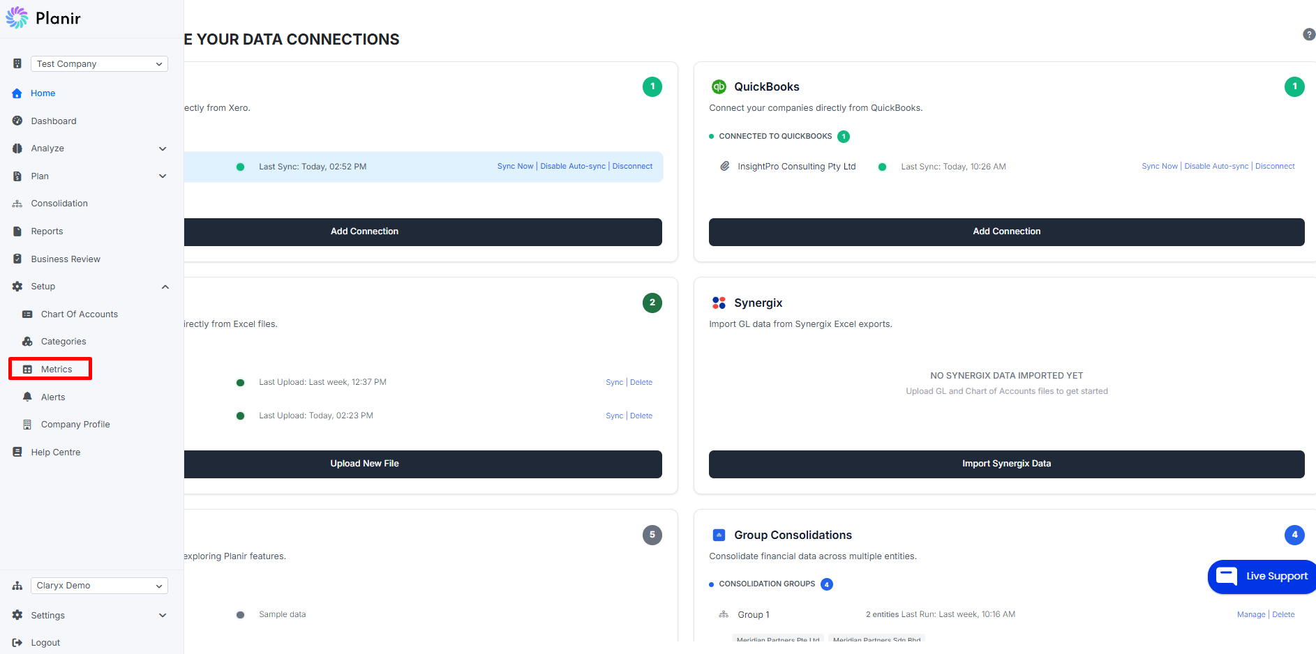
Step 1. Open the Metrics Page
- From the sidebar, expand Setup.
- Click Metrics.
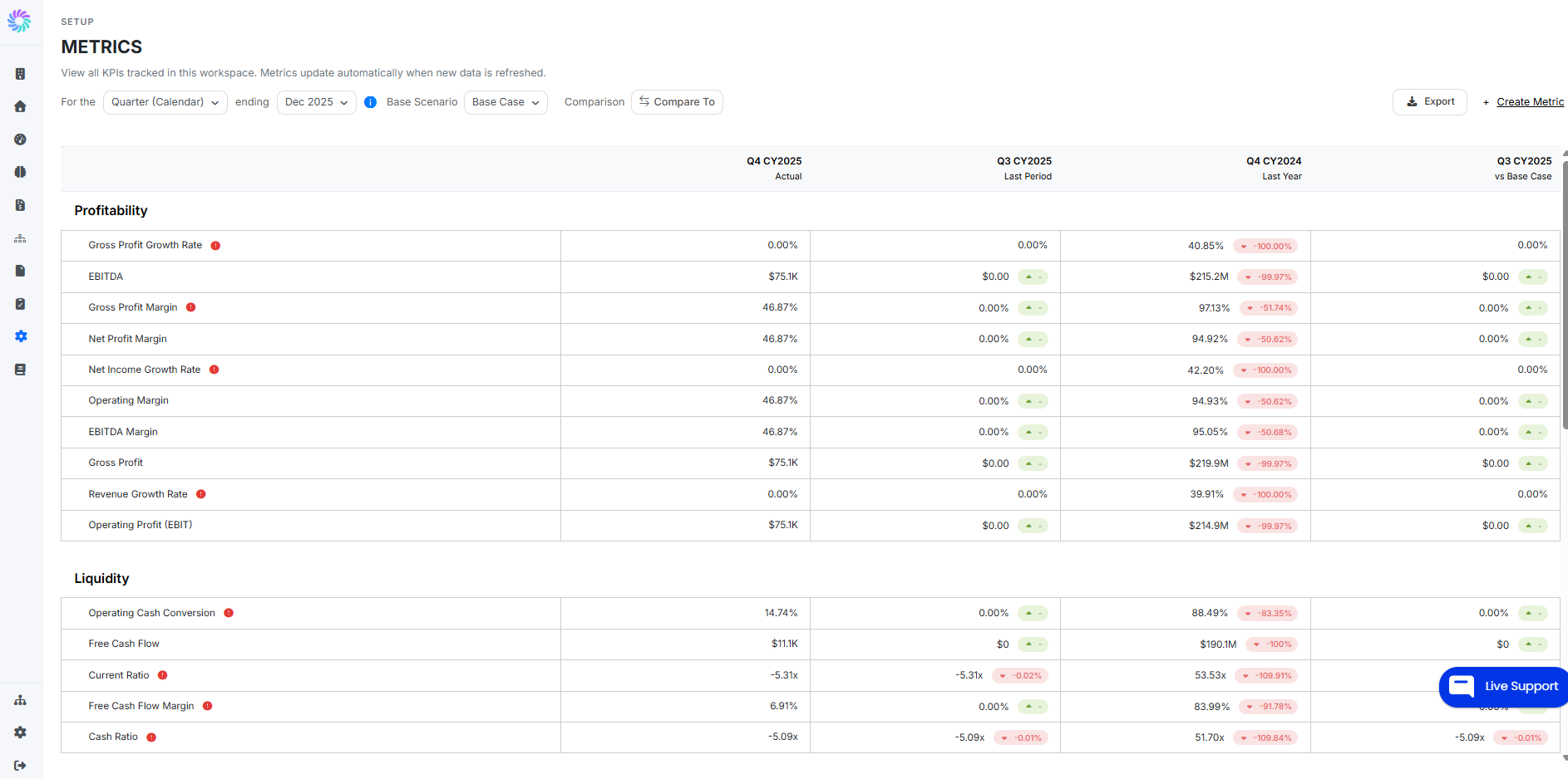
The Metrics page opens, showing every KPI tracked in your workspace, grouped into categories such as Profitability, Liquidity, and any custom categories you've defined.
Step 2. Understand the Layout
Each row on the Metrics page is one KPI. Across the top, four columns let you see how that KPI is performing:
- Actual — the value for the period you're viewing
- Last Period — the value for the immediately prior period (e.g., last month), with a percentage change vs. Actual
- Last Year — the value for the same period one year ago, with a percentage change vs. Actual
- vs Base Case — the value compared to your Base Case scenario for the comparison period selected
Green and red badges next to each comparison indicate whether the change is favorable or unfavorable, based on each metric's defined performance direction (e.g., for Net Profit Margin, higher is better; for Operating Cash Conversion, higher is better; for some cost ratios, lower is better).
A small red warning icon next to a metric name means that metric has breached its threshold. Hover over the icon to see the threshold details.
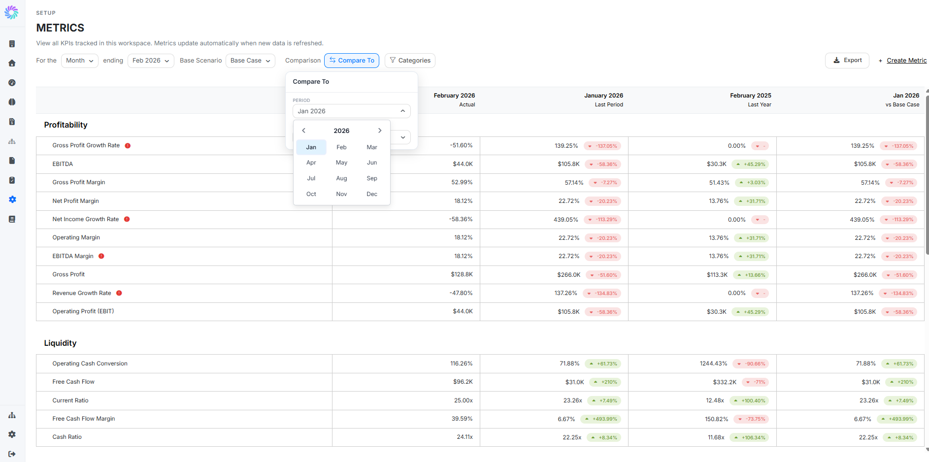
Step 3. Filter and Compare
Use the controls at the top of the page to change what you see:
- For the [Month] ending [Dec 2025] — change the period type (e.g., Month, Quarter, Year) and the period end date
- Base Scenario — select which scenario your "vs Base Case" column compares against (e.g., Base Case, Best Case, Worst Case)
- Compare To — choose any prior month or year to use as the comparison period in the rightmost column
- Categories — filter the list to show only the KPI categories you care about (e.g., just Profitability, or just Liquidity)
Step 4. Read the Indicators
For every KPI, Planir shows the same three signals:
- The badge color (green or red) tells you whether the latest value is moving in the right direction relative to the comparison
- The warning icon (red exclamation) flags any KPI that has breached its target or threshold
- The percentage change quantifies how much the value has moved between the two periods
Together these let you scan an entire category in a few seconds and zero in on the metrics that need attention.
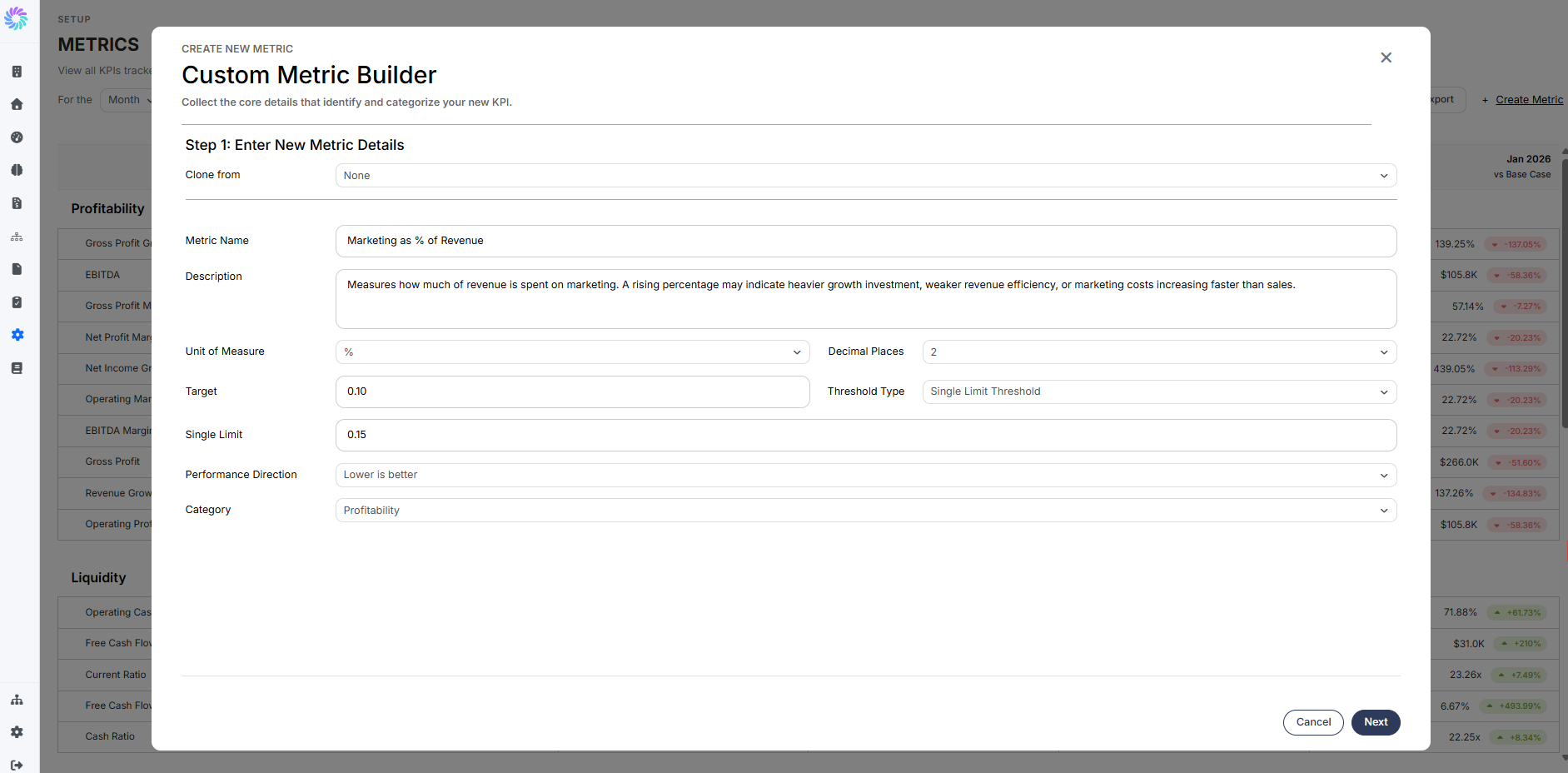
Step 5. Create a Custom Metric
When you need a KPI that isn't in the starter set, use the Custom Metric Builder.
- From the top right of the Metrics page, click + Create Metric.
- The Custom Metric Builder opens. It has two steps: Enter Metric Details and Build Your Formula.
Step 5a. Enter the Metric Details
- Clone from — optionally start from an existing metric to save time
- Metric Name — a clear label (e.g., "Marketing as % of Revenue")
- Description — what the metric measures and how to interpret it
- Unit of Measure —
%,$,x(multiple), or a count - Decimal Places — how precise to display the value
- Target — the value you're aiming for
- Threshold Type — choose Single Limit for one cutoff, or another threshold style for tiered alerts
- Single Limit — the value at which the warning icon should appear
- Performance Direction — whether higher or lower is better
- Category — the section the metric will appear under (e.g., Profitability)
Click Next to continue.

Step 5b. Build the Formula
Use the Expression Builder to define how the metric is calculated:
- Choose a source on the left — Income Statement, Balance Sheet, Cash Flow, or Model KPIs.
- Search for the accounts or sub-accounts you want to include and click to add them as elements in the expression.
- Use the operator buttons (
+,−,×,÷, parentheses) to assemble the formula. - Set the Roll-Up Rule to define how the metric aggregates across periods (e.g., Sum of Months for additive metrics, Average of Months for ratios).
Click Finish to save the metric. It will appear under its assigned category on the Metrics page from the next refresh.
Managing Your Metrics
Clone a metric
Use Clone from in Step 1 to start a new metric from an existing one useful when you need a near-duplicate with a slightly different formula or threshold.
Edit an existing metric
Click any metric row on the Metrics page to reopen the Custom Metric Builder and adjust details, formula, or thresholds.
Adjust thresholds without rebuilding the formula
If only your target or limit has changed, edit the metric and update the Target or Single Limit values in Step 1 no need to touch the formula.
Group related metrics
Use the Category field to keep related metrics together. Custom categories you create here will appear as new sections on the Metrics page.