KPI Summary (Metrics)
Use the Metrics page as your KPI summary view a single screen where you can scan every KPI you track, compare against last period, last year, or your Base Case scenario, and drill into any metric to see its trend, target, and threshold history.
Why this matters
Your KPIs only earn their keep if you actually look at them. The Metrics page is designed for fast, repeatable scanning green and red indicators tell you where to focus, threshold warnings flag what needs attention, and the drill-in chart shows you whether a problem is a one-month blip or a multi-month trend. Treating it as your monthly diagnostic dashboard turns scattered numbers into a clear picture of business health.
When to use this
- During your monthly close to spot anything that's slipped
- Before a board, leadership, or investor meeting to gather the headline numbers
- When you suspect a metric is moving in the wrong direction and want to confirm with history
- When investigating a flagged threshold breach surfaced by Alerts
Before You Start
Make sure you have:
- A connected data source so KPIs are populated
- Your KPIs configured with Targets and Single Limits in Setting Up KPIs (so threshold indicators light up)
- Your reporting period and Base Case scenario set up
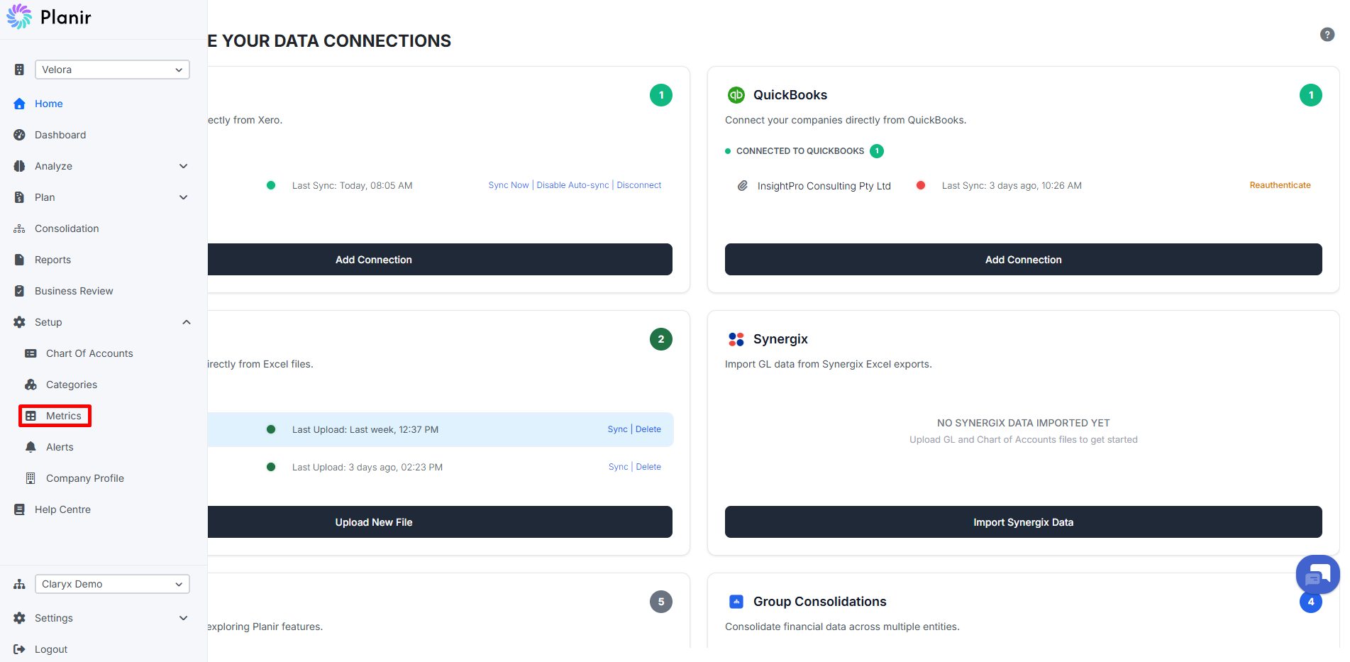
Step 1. Open the Metrics Page
- From the sidebar, expand Setup.
- Click Metrics.
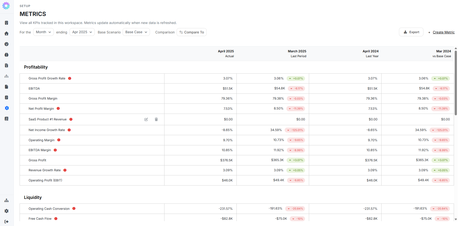
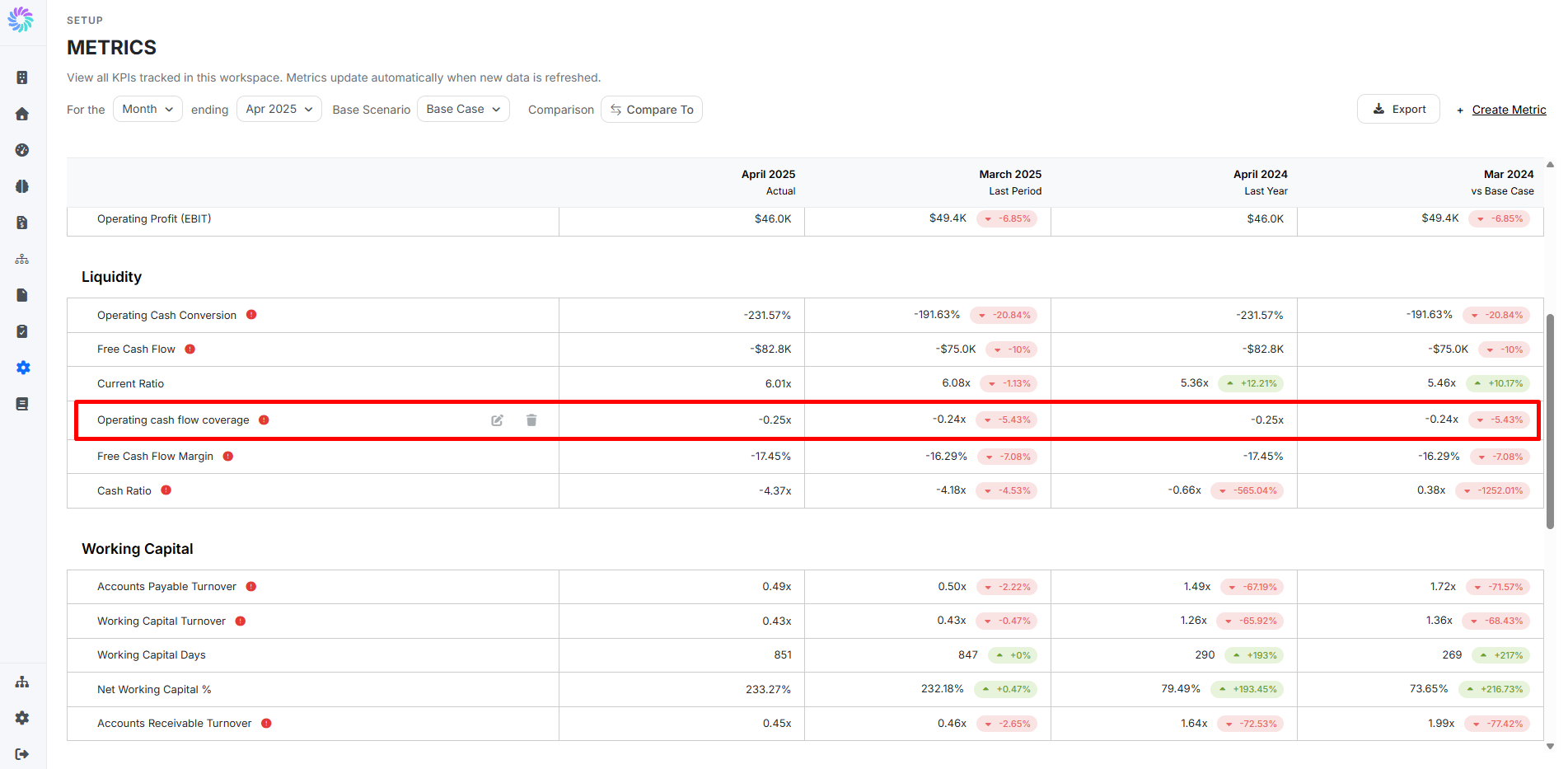
The page opens with every KPI tracked in your workspace, grouped by category (Profitability, Liquidity, Working Capital, etc.).
Step 2. Scan the Comparison Columns
Each KPI row shows four values across the top:
- Actual — the value for the period you're viewing
- Last Period — the immediately prior period (e.g., last month), with a green/red change badge
- Last Year — the same period one year ago, with a change badge
- vs Base Case — comparison against the chosen scenario
The badges are colored by performance direction, not raw movement. So a 10% drop in Operating Margin shows red (bad), but a 10% drop in Working Capital Days might show green (good capital is freed up faster). Trust the color, not the arrow.
Step 3. Read the Threshold Warning Icons
A red warning icon next to a metric name means the metric has breached its Single Limit in the current period. Hover the icon to see the threshold value at a glance.
These warnings are your priority list. Scan top to bottom every flagged metric is something worth looking at before moving on.
Step 4. Adjust Filters and Comparisons
Use the controls at the top to change what you're scanning:
- For the [Month] ending [Date] — change the period type (Month, Quarter, Year) and end date
- Base Scenario — pick which scenario the "vs Base Case" column compares against (Base Case, Best Case, Worst Case)
- Compare To — choose any prior period for the rightmost column
- Categories — filter the list to just the categories you care about
When working through a monthly close, set this up once at the start of the review and the comparisons stay applied as you scroll.
Step 5a. Enter the Metric Details
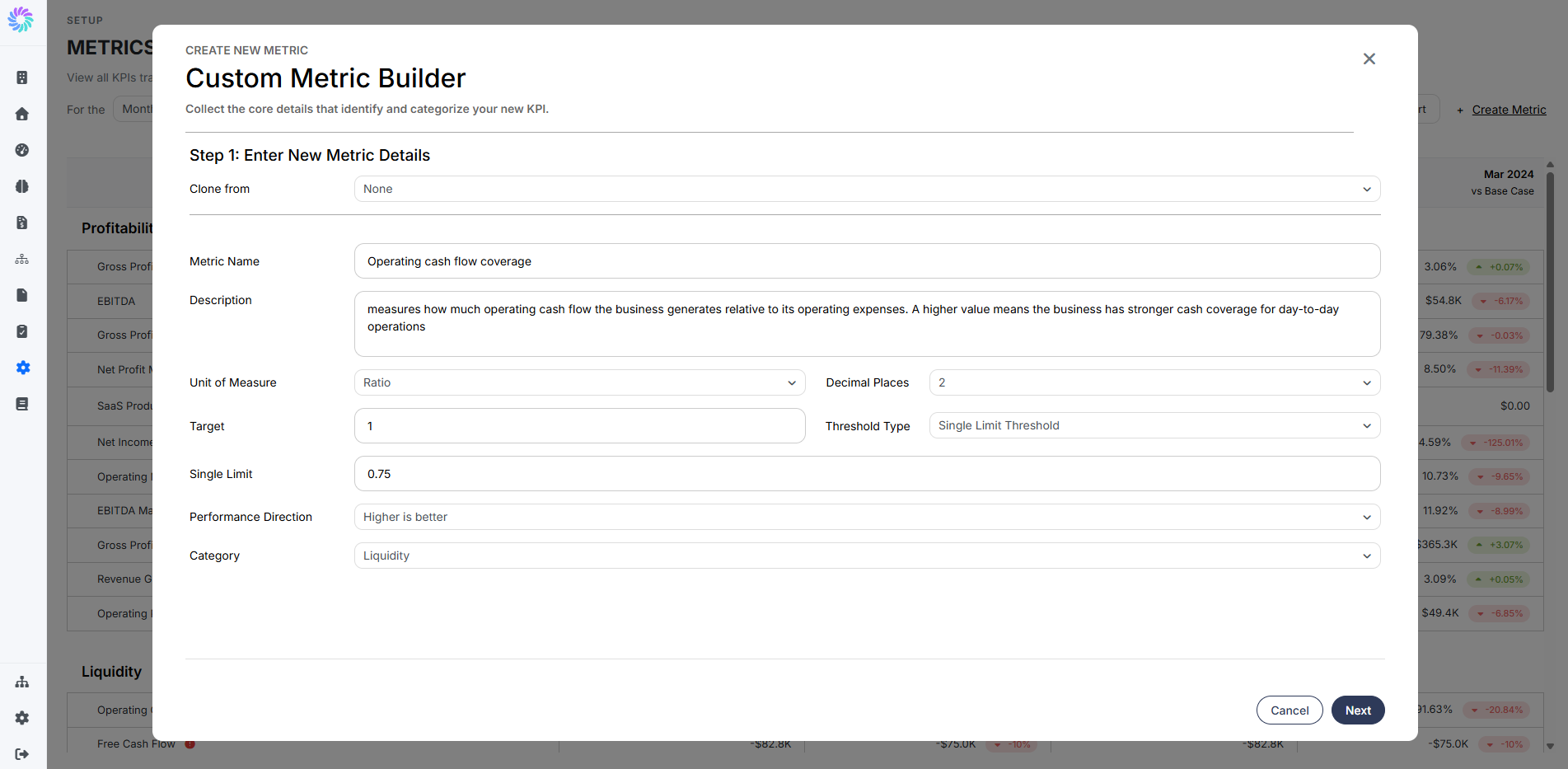
When the starter KPIs don't cover something you want to track, click + Create Metric in the top right of the page. The Custom Metric Builder opens with two stages.
Fill in:
- Clone from — optionally start from an existing metric to save time
- Metric Name — a clear label (e.g., "Operating cash flow coverage")
- Description — what the metric measures and how to interpret it
- Unit of Measure —
%,$,Count, orRatio - Decimal Places — how precise to display the value
- Target — the value you're aiming for
- Threshold Type and Single Limit — when the warning icon should appear
- Performance Direction — whether higher or lower is better
- Category — which section the metric will sit under (e.g., Liquidity)
Click Next to continue.
Step 5b. Build the Formula
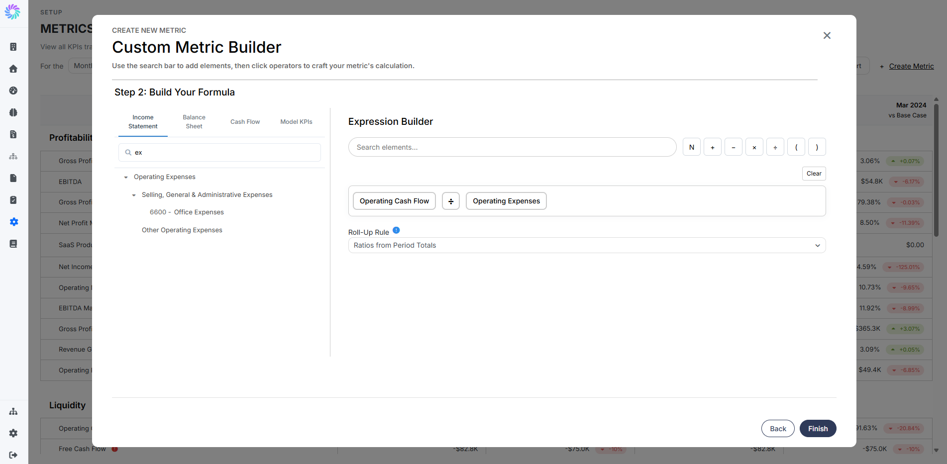
In the Expression Builder, define how the metric is calculated:
- Choose a source on the left — Income Statement, Balance Sheet, Cash Flow, or Model KPIs.
- Search for and click the accounts you want to include as elements in the expression.
- Use the operator buttons (
+,−,×,÷, parentheses) to assemble the formula. - Set the Roll-Up Rule for how the metric aggregates across periods (e.g., Ratios from Period Totals for ratios, Sum of Months for additive metrics).
Click Finish to save. The new metric appears under its assigned category on the Metrics page from the next refresh.
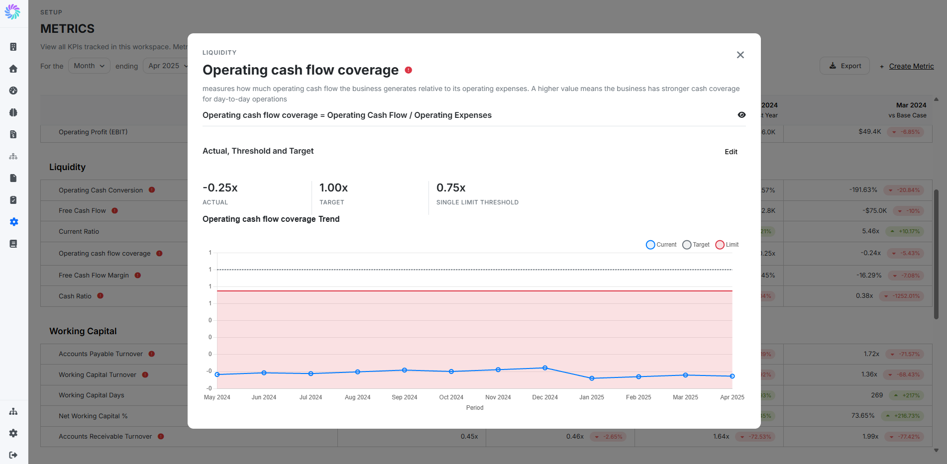
This view is where casual scanning becomes diagnosis. Three things to look for:
- How often does the line cross into the red zone? A single dip is noise; repeated dips are a pattern
- Is the metric trending toward or away from the target? The dashed Target line gives you the reference to read against
- Are the recent months better or worse than the longer trend? Helps you separate "always like this" from "newly off"
Step 7. Take Action on What You Find
After the scan and drill-in, the typical next step is one of:
- Investigate the underlying accounts in Account Intelligence to find the driver
- Look at individual transactions in Transaction Intelligence if the issue looks anomaly-shaped
- Adjust the Target or Limit by editing the metric — open the detail modal and click Edit
- Add the metric to an Alert group in Setup → Alerts so the next breach lands in your inbox