How Planir’s Data Structure Works
Understand how Planir organizes your financial data across transactions, accounts, and categories — and how this structure shapes your reports, KPIs, dashboards, and AI summaries.
Why this matters
Planir groups and interprets your data based on a layered structure. When you know how the structure works, it becomes easier to validate your numbers, diagnose category issues, and understand why Planir displays data the way it does.
When to use this
- When an account appears in the wrong category
- When a KPI or dashboard tile isn't pulling the values you expect
- When you want to understand how Planir reads your accounting data
- When reviewing differences between Planir and your source system (Xero, QuickBooks, Excel, or Synergix)
Understand how Planir organizes your financial data across transactions, accounts, and categories and how this structure shapes your reports, KPIs, dashboards, and AI summaries.
How it works
Planir organizes your financial data in three layers: Transaction, Account (GL), and Category. The easiest way to see two of these layers at a glance is the Chart of Accounts:
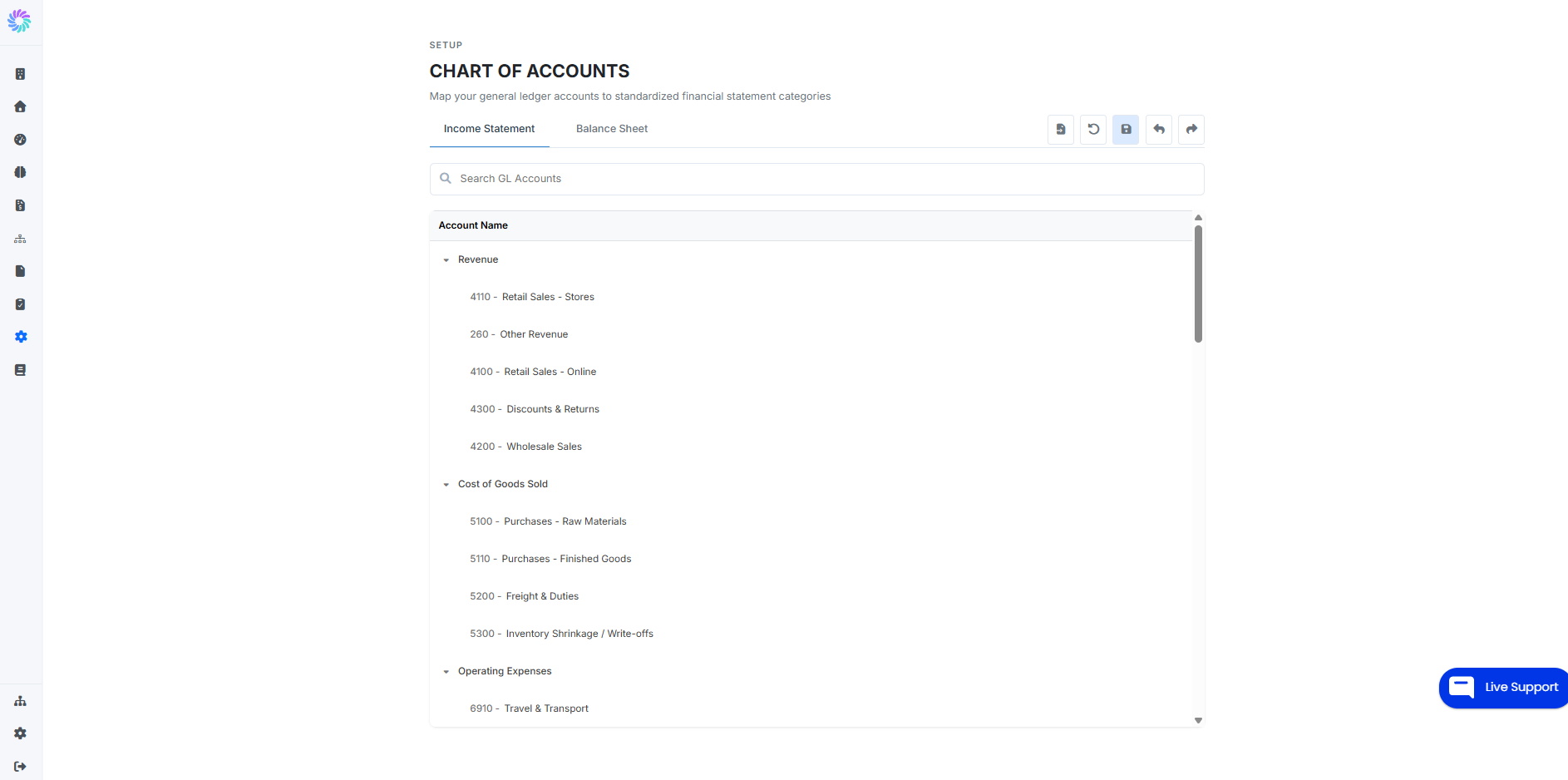
In the screenshot above, Revenue and Cost of Goods Sold are Categories, and each account listed beneath them (for example, 4110 - Retail Sales - Stores) is the Account Level. The Transaction Level isn't visible here — those are the individual entries from your accounting system that roll up into each account.
Putting all three together:
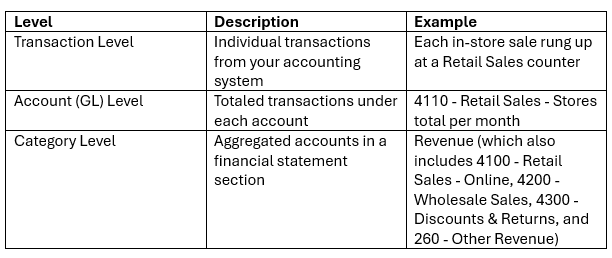
Each layer feeds the next. Transactions roll up into accounts, accounts roll up into categories, and categories form the structure of your Income Statement, Balance Sheet, and Cash Flow. This layered structure is what allows Planir's AI to perform multi-level analysis from executive overviews down to transaction-level insights.
How this affects what you see in Planir
- Reports (Income Statement, Balance Sheet, Cash Flow) display values rolled up to the Category Level — so you'll see one Revenue line that combines all five revenue accounts above.
- KPIs and dashboard tiles are calculated from accounts and categories so a misclassified account (for example,
4300 - Discounts & Returnsaccidentally placed outside Revenue) can throw off any tile that depends on it. - AI summaries and Executive Briefings read across all three layers, which is how Planir can move smoothly from a category-level headline ("Revenue up 8% this quarter") to an account-level explanation ("driven by
4110 - Retail Sales - Storesand4100 - Retail Sales - Online") and then a transaction-level detail ("with the largest single sale on 14 March").
Example
Take a single retail sale in your accounting system.
- At the Transaction Level, that one sale sits as an individual line in your General Ledger.
- At the Account (GL) Level, it's added to every other in-store sale this month, totaling up under
4110 - Retail Sales - Stores. - At the Category Level, that account rolls up under Revenue, alongside
4100 - Retail Sales - Online,4200 - Wholesale Sales,4300 - Discounts & Returns, and260 - Other Revenue.
When Planir displays your Income Statement, your sales KPIs, or an AI insight on revenue performance, it's reading from this layered structure to give you the right view at the right level of detail.