Activity Forecast (Driver-Based)
The Activity Forecast page is where you build driver-based forecasts in Planir. Instead of forecasting accounts directly, you create real-world activities (a new hire, a marketing campaign, a new wholesale customer) and Planir automatically flows their financial impact into the right accounts on the P&L and Balance Sheet.
Why this matters
Top-down forecasting (a single growth rate applied to revenue) tells you what numbers to expect, but not why. Driver-based forecasting flips it around: you describe the business decisions you are planning, and the forecast follows. This makes assumptions easier to defend, easier to revise, and easier to explain to leadership when the numbers change.
When to use this
- When forecasting headcount changes (new hires, leavers, role changes)
- When planning a marketing campaign or product launch and want to see its effect on the P&L
- When modeling new customer wins, channel additions, or pricing changes
- When pulling apart what is driving a forecast jump (or dip) in a specific account
Before You Start
Make sure you have:
- A connected data source so accounts are populated
- Your Chart of Accounts reviewed in Setup, Chart of Accounts, since each activity line is mapped to a specific account
- A clear picture of the activities you want to model: name, category, the accounts they affect, the period they apply to, and the dollar value
Step 1. Open the Activity Forecast Page
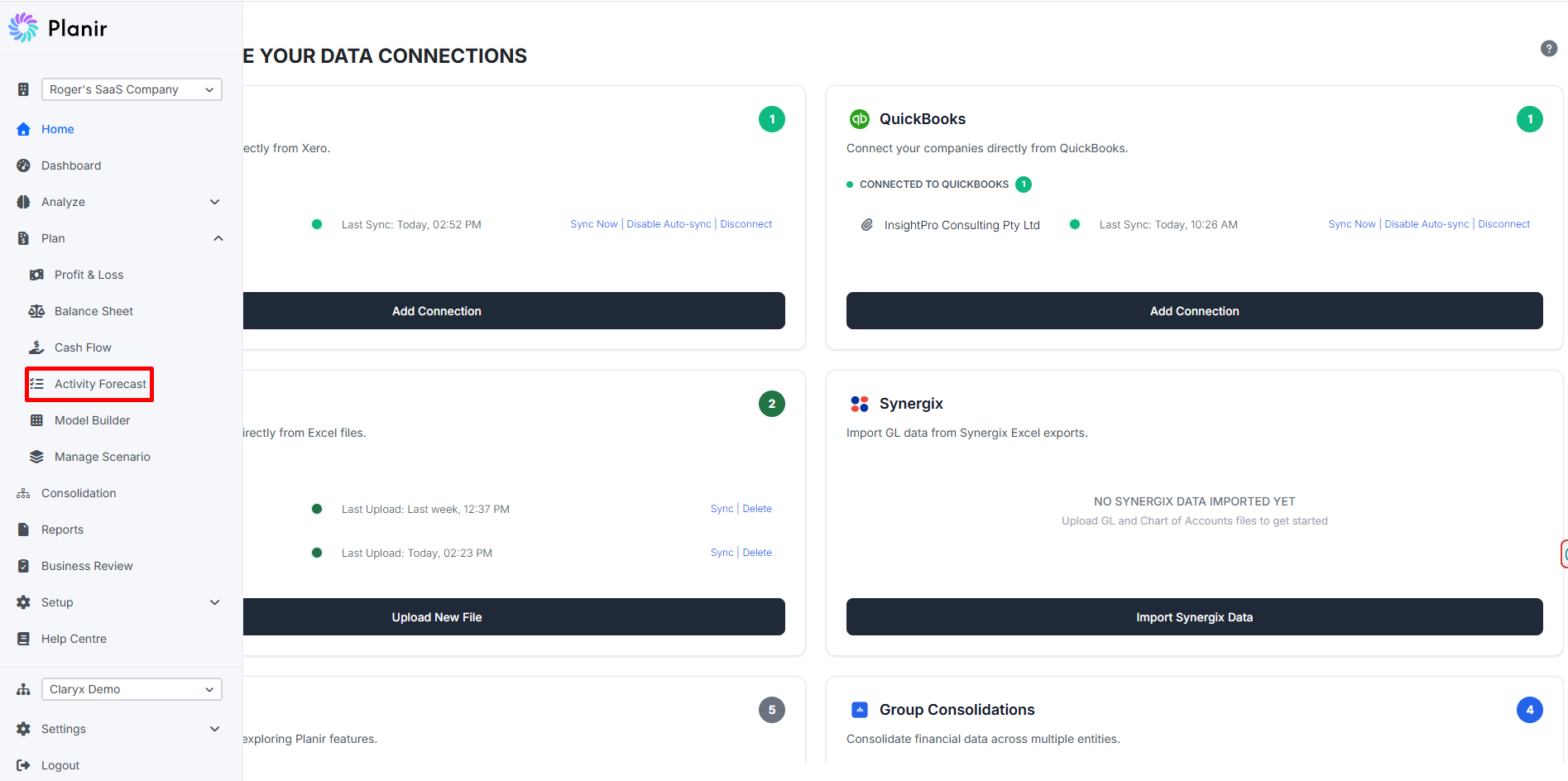
- From the sidebar, expand Plan.
- Click Activity Forecast.
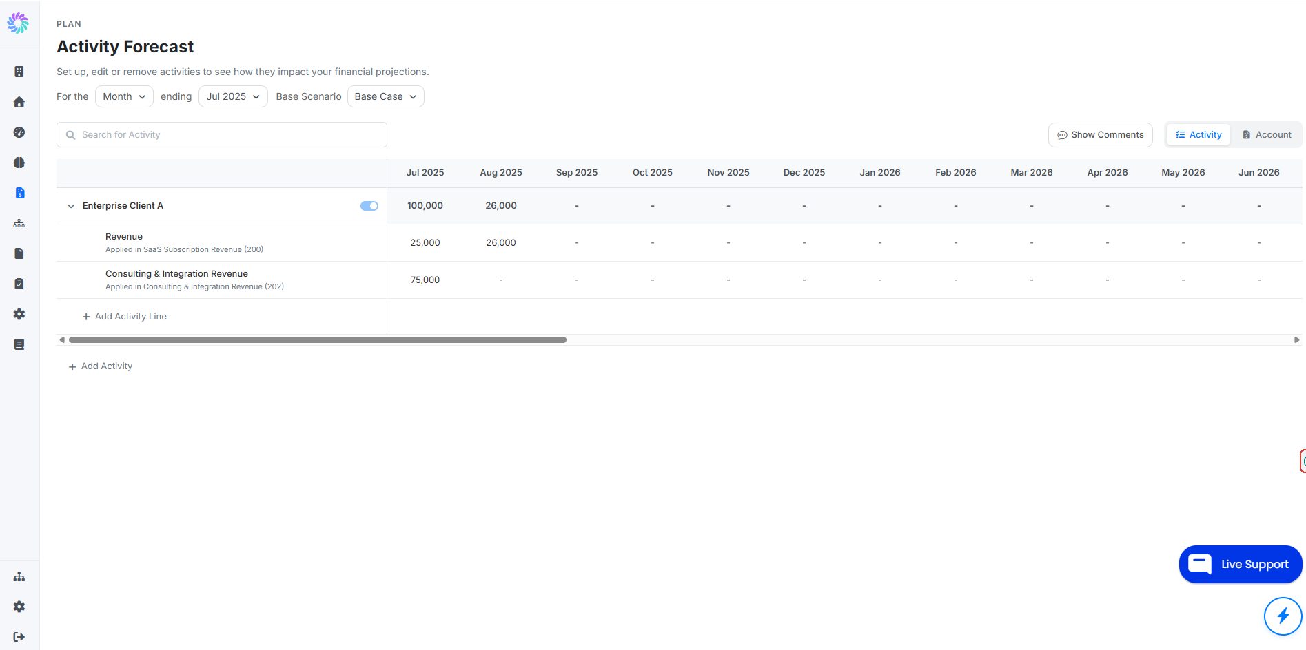
The page opens with periods running across the top and any existing activities listed down the left.
Use the controls at the top to set the period type (Month, Quarter, Year), the period end date, and the Base Scenario the activities should reflect.
Step 2. Understand the Layout
Each activity has three layers:
- Activity row at the top: the name and category of the business event. Each activity has a toggle to include or exclude its impact from the forecast.
- Activity line beneath the activity: a description plus the account it flows into. An activity can have multiple lines if it impacts multiple accounts.
- Period values across the columns: the dollar amount the activity contributes to the mapped account in each period.
The toggle at the top right of each activity row lets you switch between viewing data By Activity (grouped under the activity name) and By Account (grouped under the destination account).
Step 3. Add a New Activity
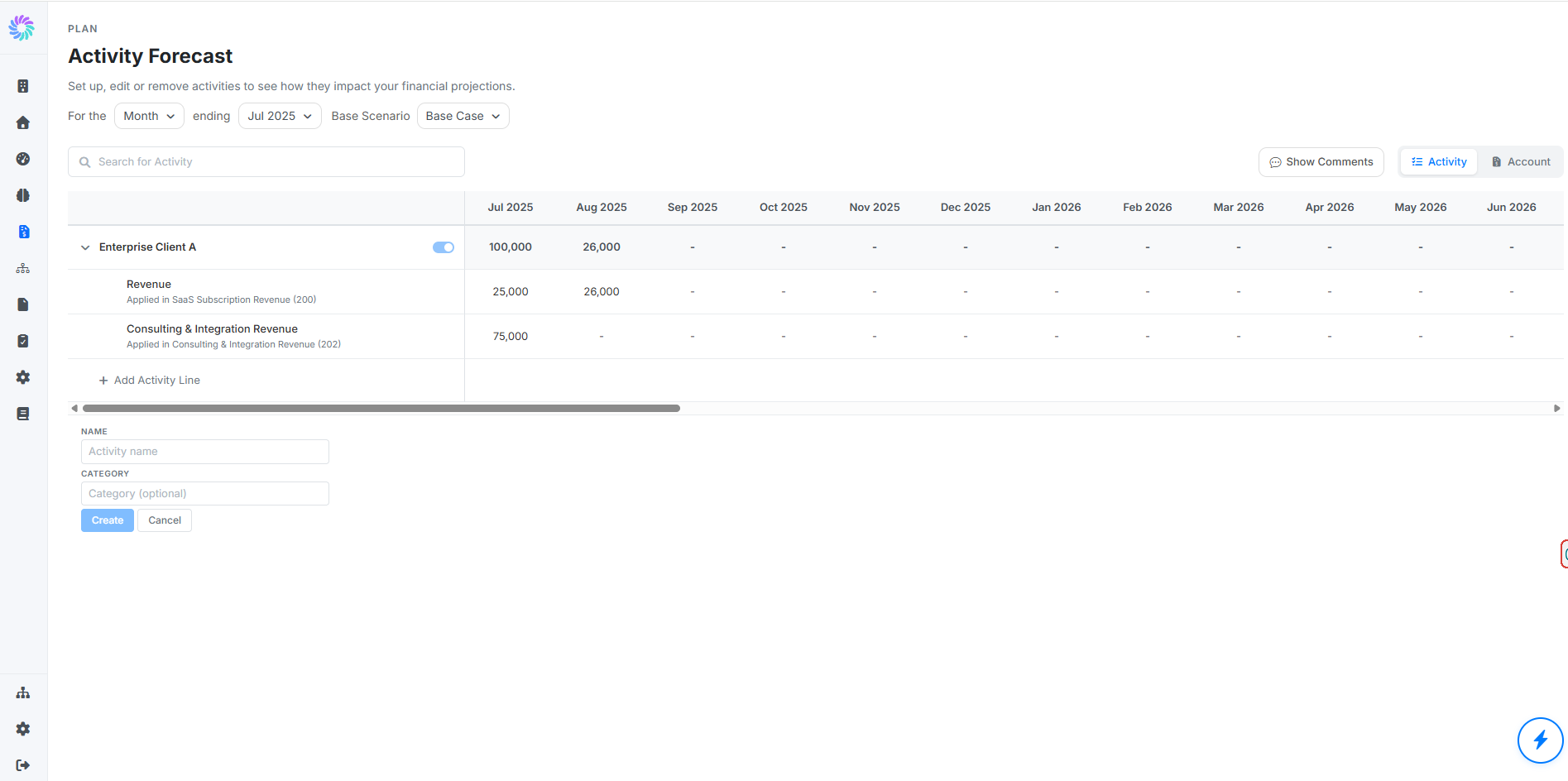
- Click + Add Activity at the bottom of the table.
- A small form appears with two fields:
- NAME: a clear label for the activity (for example, "Q3 Marketing Campaign", "New Hire", "Acme Co. Wholesale Contract")
- CATEGORY: a grouping label that helps you organize activities (for example, "Marketing", "Headcount", "Sales")
Click Create.
The activity appears in the table, ready to have lines added to it.
Step 4. Add Activity Lines
An activity line is what actually flows into your forecast. Each line maps a description and a value to a specific account.
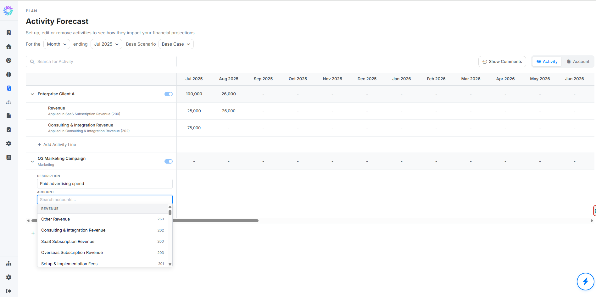
- Click + Add Activity Line under your activity.
- Enter:
- DESCRIPTION: what the line represents (for example, "Monthly salary for new hire", "Paid advertising spend", "Monthly recurring wholesale revenue")
- ACCOUNT: search and select the account this line should flow into. Accounts are organized by Revenue, Cost of Goods Sold, Operating Expenses, and so on, matching your Chart of Accounts.
Click Add.
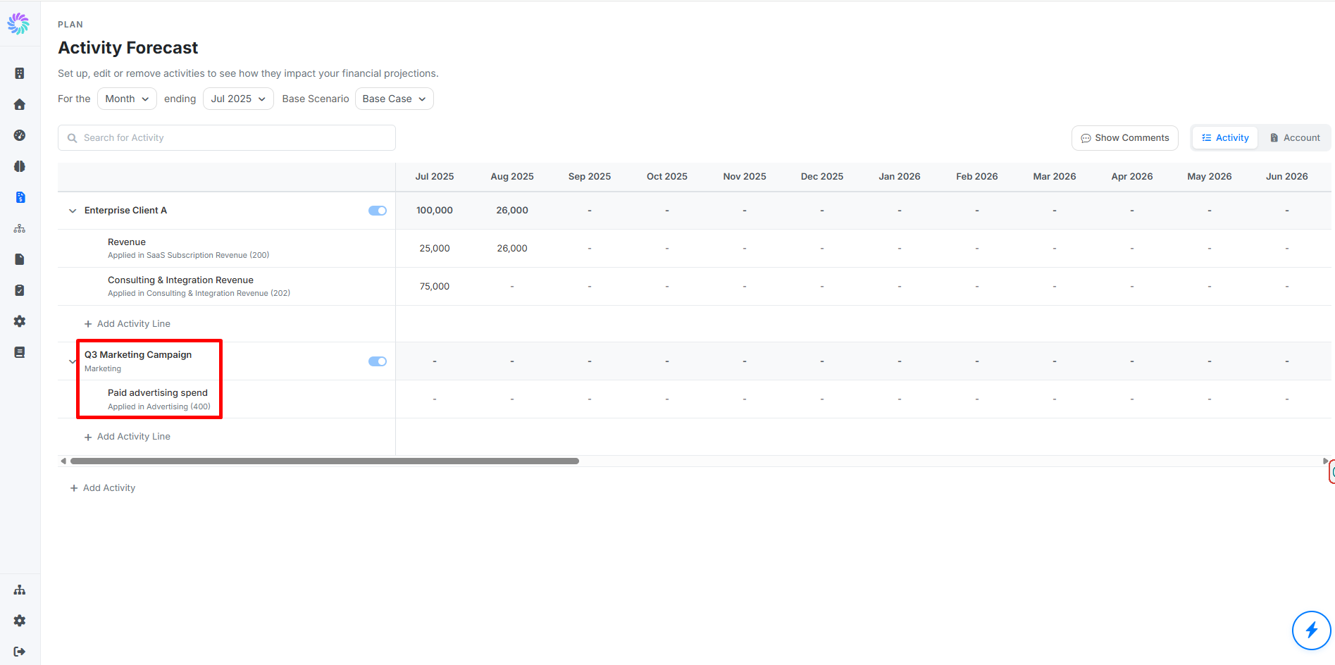
The line appears beneath the activity, ready for values.
You can add as many lines under a single activity as you need. For example, a "New Hire" activity might have one line for Salaries & Wages, another for Superannuation, and another for Office Supplies.
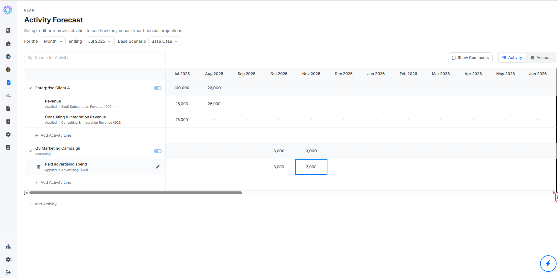
Step 5. Enter Values for Each Period
Click any period cell on the activity line and type in the dollar value for that period.
A few patterns to know:
- Time-bound activities (for example, a Q3 marketing campaign): enter values only in the months the activity applies. Leave other months blank or as a dash.
- Open-ended activities (for example, a new hire): enter the recurring value in every month from the start date onwards.
- Revenue or expense: positive numbers represent inflows for revenue accounts and outflows for expense accounts. Planir applies the sign correctly based on the mapped account.
The activity row above automatically aggregates the values from all its lines for each period.
Step 6. Toggle Activities On or Off
Each activity has a toggle at the top right of its row. Switch it off to exclude the activity's impact from the forecast (useful for stress-testing scenarios), and switch it on to include it again.
Toggling does not delete the activity. Its values are preserved for whenever you want to bring it back into the forecast.
Step 7. View by Activity or by Account
Use the Activity / Account toggle at the top right of the page to switch the grouping:
- By Activity (default): activities are grouped together with their lines beneath them. Best for managing activities and seeing each one's overall impact.
- By Account: activity lines are grouped under their destination accounts. Best for seeing every activity that touches a specific account, such as Salaries & Wages