Account Intelligence
The Account Intelligence page drills into the accounts behind a finding. Where Executive Summary tells you what is happening, Account Intelligence shows you why. It pulls a chosen set of accounts together, charts their behavior across periods, and writes a root-cause narrative explaining the contribution of each driver to the overall change.
Why this matters
A flagged number on Executive Summary or a red row on Variance Analysis is only the start of the conversation. Someone always asks "why?" Account Intelligence is the page built to answer that. The AI looks at the selected accounts, identifies the largest contributors and structural patterns, and writes a plain-English explanation you can paste into board commentary or a follow-up email.
When to use this
- Immediately after clicking Investigate on an Executive Summary card
- When a row on Variance Analysis looks unusual and you want to see the underlying accounts
- When preparing board commentary that needs a "what is driving this" paragraph
- When responding to audit or lender questions about account-level movements
Before You Start
Make sure you have:
- Connected data sources so actuals are loaded for the periods you want to analyze
- The correct entity or group selected in the sidebar dropdown
- A clear question in mind (the page is most useful when you know what you are looking for)
Step 1. Open Account Intelligence
There are two ways into the page:
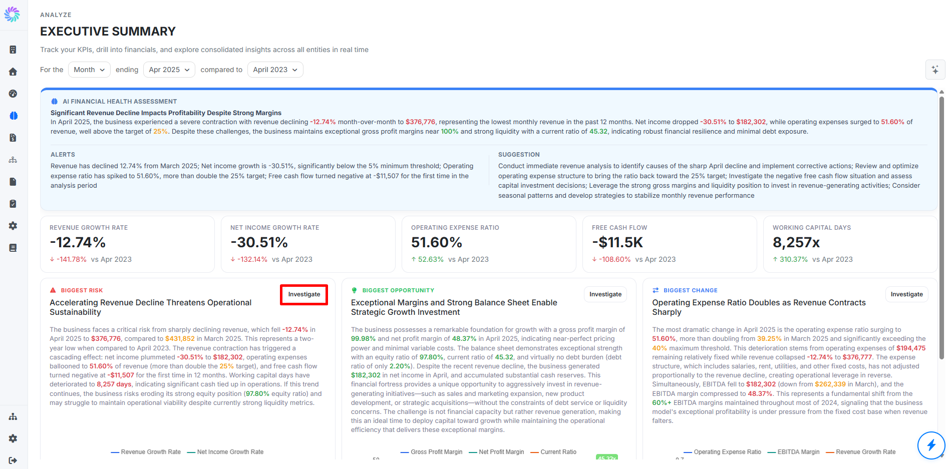
- From Executive Summary, click Investigate on the Biggest Risk, Biggest Opportunity, or Biggest Change card. The page opens pre-filtered for the period, comparison, and accounts behind that finding.
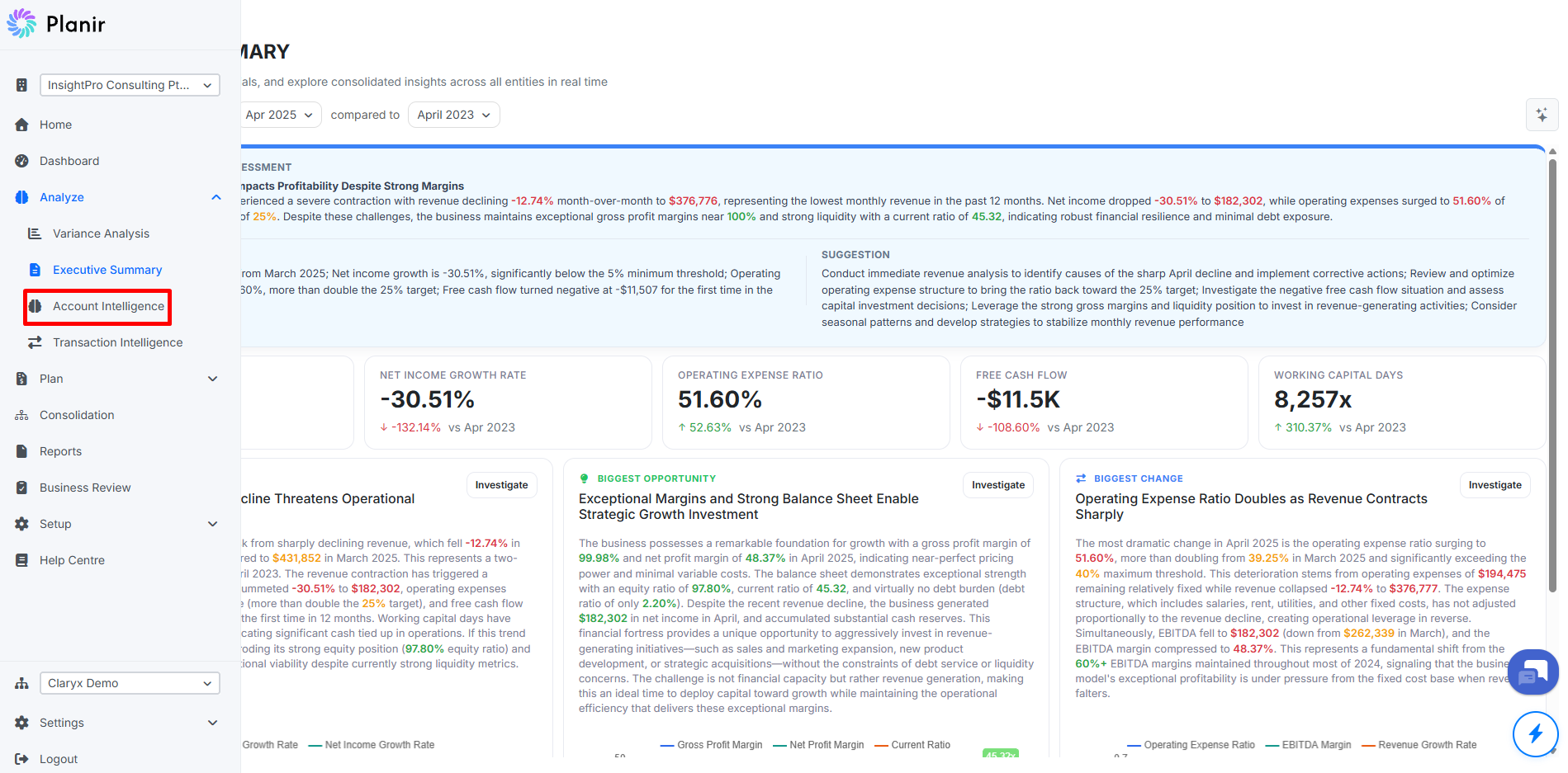
- From the sidebar, expand Analyze and click Account Intelligence. The page opens with a default period and account selection that you can refine.
Most users arrive via Investigate, so the period and account selection are usually already where you want them. Read through the page first (Steps 2 to 4), then adjust the period or accounts only if you need to (Steps 5 and 6).
Step 2. Review the Headline KPIs
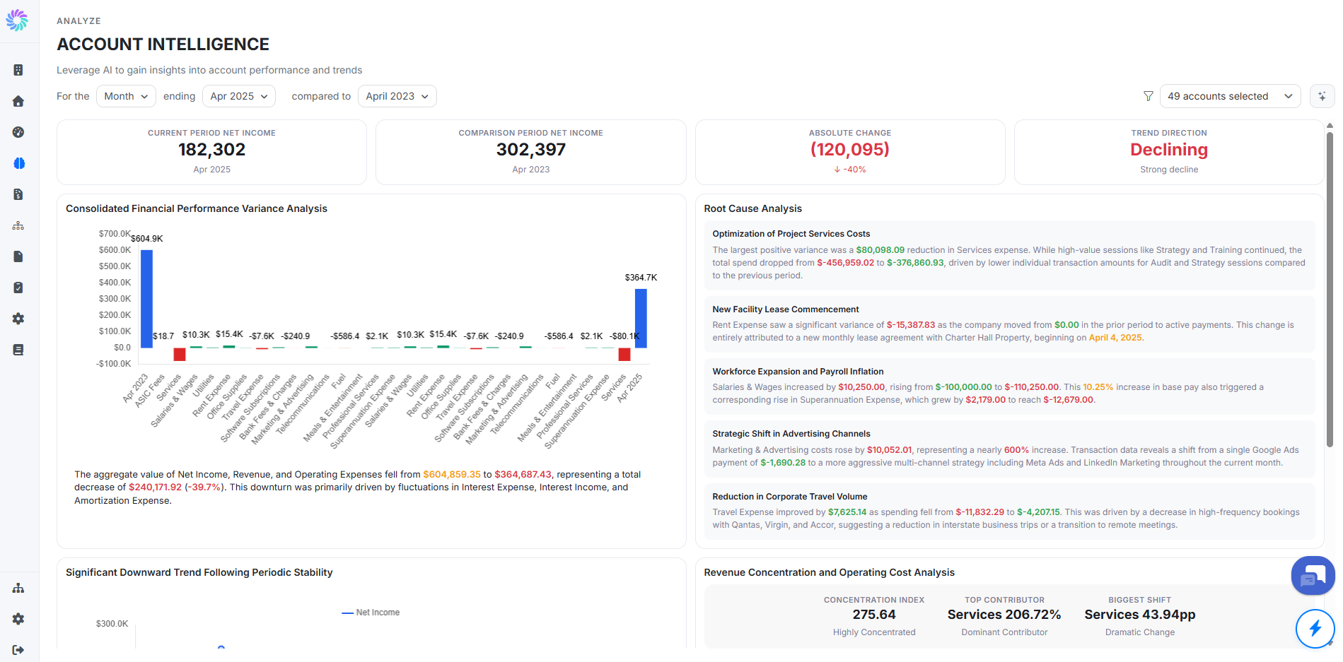
The four KPI tiles at the top of the page summarize the selected account set:
- Current Period: the value for the period under analysis
- Comparison Period: the value for the comparison period
- Absolute Change: the difference between the two periods, with the percentage change beneath
- Trend Direction: a one-word read on the trajectory (for example, Growing, Declining, Stable) with a sub-label describing the strength of the trend
Step 3. Read the Performance Chart and Root Cause Analysis
The main panel on the left, Aggregated Performance Analysis, plots the period totals and the largest contributing components as bars so you can see at a glance where the change came from. Below the chart, a short paragraph summarizes the movement in plain English.
The panel on the right, Root Cause Analysis, categorizes the drivers behind the change. Each entry has:
- A category heading, such as Stagnant Operational Cash Flow or Absence of Capital Expenditure
- A paragraph describing what was observed in the underlying accounts and how it contributed to the overall variance
Read the chart and summary first to understand the size of the change, then read the root cause categories to understand the structural drivers.
Step 4. Explore the Detail Charts
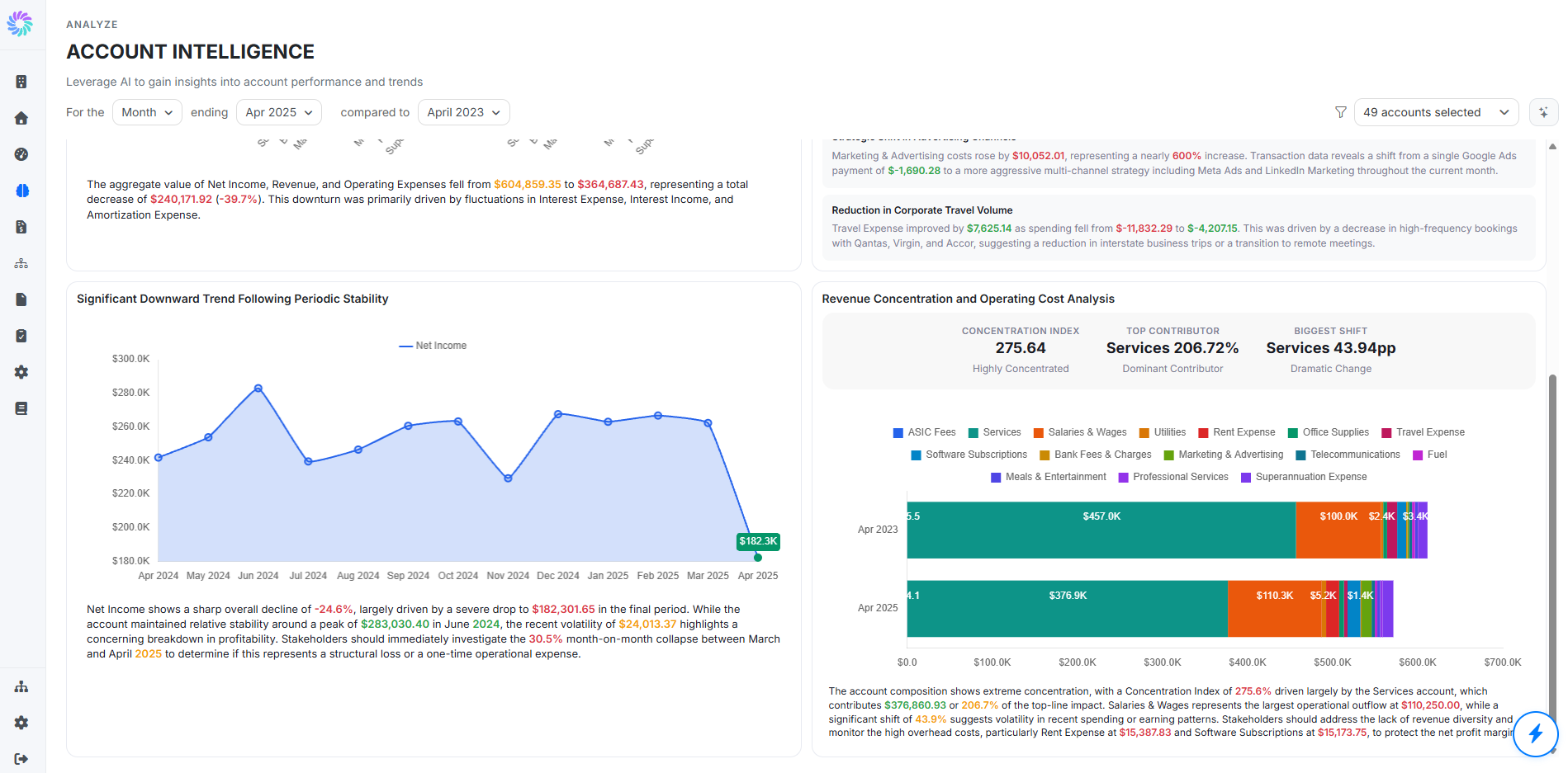
Below the main panels, two further charts go deeper:
- Trend chart (for example, Temporary Capital Outlay Followed by Recovery): a line chart of the selected account across multiple historical periods, with a written commentary highlighting outlier movements and what to investigate
- Account composition chart (for example, Inactive Investing Cash Flow Category Structure): a horizontal bar chart breaking the parent account down into its child accounts for the comparison period, with a narrative describing the concentration
Each detail chart has its own commentary paragraph explaining what the chart shows and what to investigate next. Use these to confirm the headline narrative or to find anomalies the root cause analysis did not surface.
Step 5. Adjust the Period and Comparison
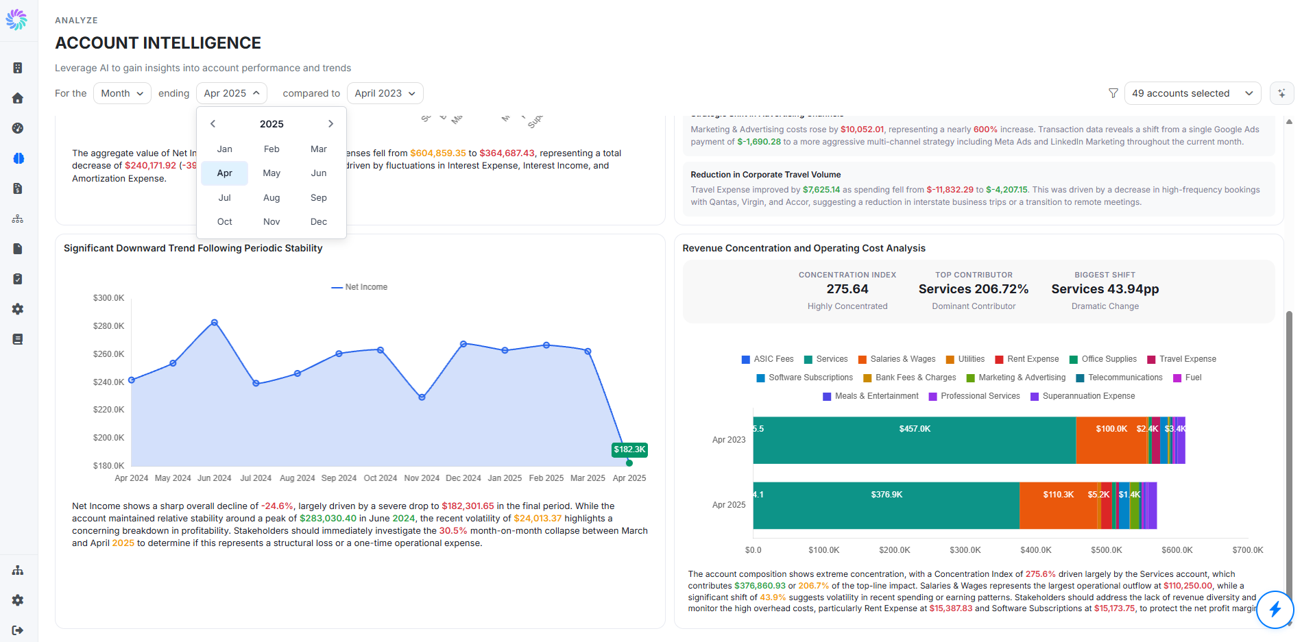
If the page did not open on the period you want, or you want to test a different comparison window, use the controls at the top of the page:
- For the [Period Type]: Month, Quarter (Calendar), Quarter (Fiscal), Year (Calendar), or Year (Fiscal)
- Ending [Date]: the period under analysis
- Compared to: the prior period to benchmark against
The KPI tiles, charts, and root cause narrative all regenerate when any of these change.
Step 6. Adjust the Accounts Selected
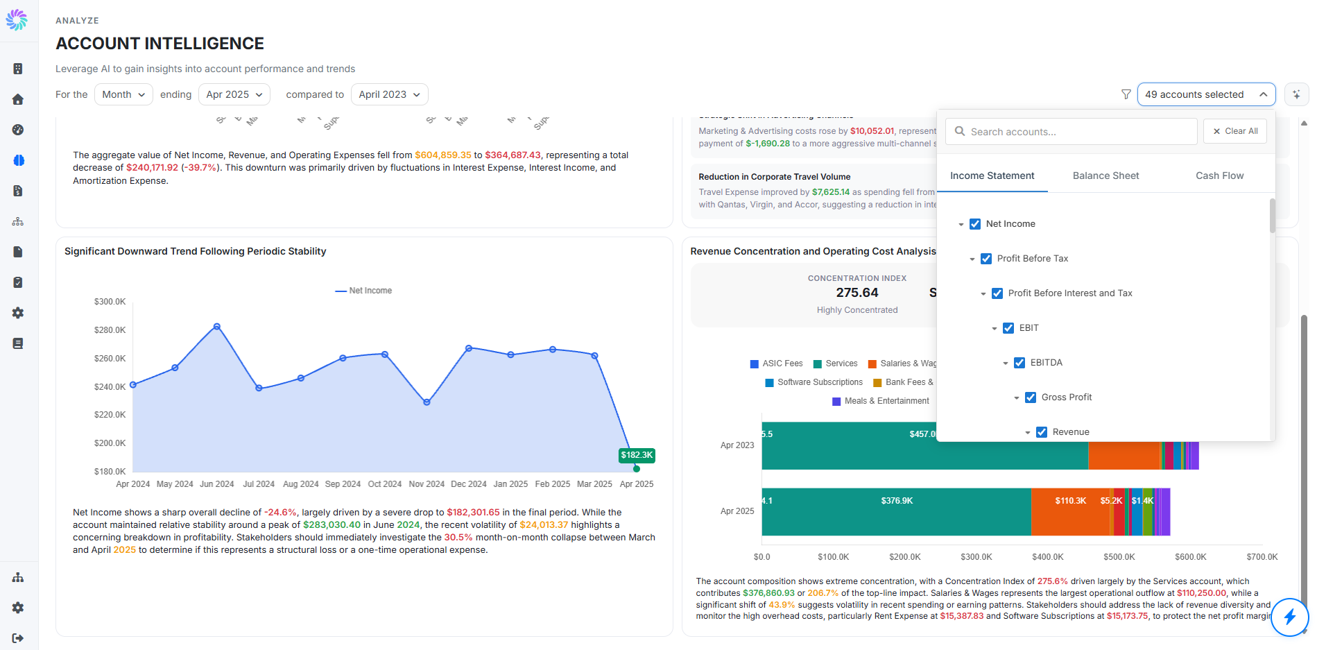
If you arrived via Investigate, the picker is already set to the accounts behind the finding. To change which accounts are included in the analysis, click the [X] accounts selected button at the top right of the page. The picker has:
- Search accounts: type to filter by account name or code
- Tabs: Income Statement, Balance Sheet, and Cash Flow to switch between statement views
- Account tree: parent accounts with expand and collapse arrows, so you can drill into the chart of accounts hierarchy
- Checkboxes: tick a parent to include all of its children, or tick individual leaf accounts
- Clear All: resets the selection
The page updates as you change the selection, so you can iterate (broaden the selection to see context, narrow it to isolate a driver) without leaving the page.